


Brand Identity
Building distinctive visual identities that give brands clarity, consistency, and a strong market presence.
Project
Wisebuy Home Loans
Overview
Wisebuy Home Loans needed a refreshed brand identity that felt more aligned with the people behind the business: confident, approachable, trustworthy, and professional.
Role
Logo Design, Brand Identity, Visual Direction, Website Design

Challenge
The finance and mortgage space is highly competitive, so the challenge was to create a distinctive identity that felt credible and memorable without looking generic or overly corporate.
Approach
I explored multiple logo directions, refined the strongest concepts through feedback, and developed a clean visual identity with a clear colour direction and brand feel. Once the identity was approved, I translated the same visual language into a modern, user-friendly website design.
Outcome
A polished brand refresh with a distinctive logo, stronger visual consistency, and a professional website experience built around trust, clarity, and approachability.

Project
Inductions Made Easy
Overview
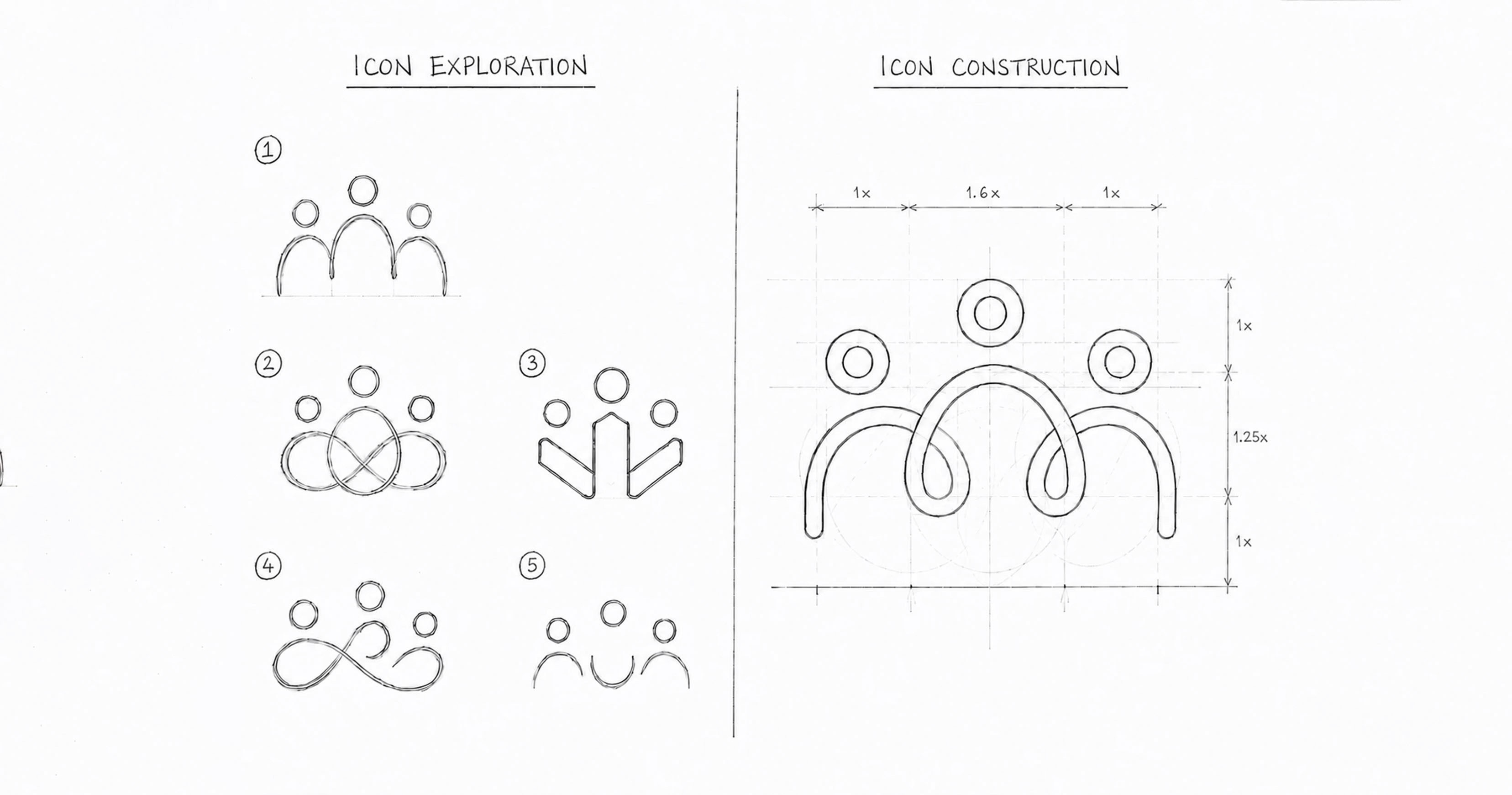
Inductions Made Easy supports companies by managing the onboarding, induction, and orientation process for new employees. The brand needed a simple, professional identity that clearly communicated ease, guidance, and connection between the company and its employees.
Role
Logo Design, Brand Identity, Visual Direction
Challenge
The challenge was to create a minimal identity that felt approachable and service-driven, while still looking credible for MNCs and corporate clients. The logo also needed to visually express the idea of support without becoming too literal or complex.
Approach
I developed a concept around the idea of hand-holding and smooth transition. The visual mark represents the Inductions Made Easy team bridging the gap between the employee and the company, making the onboarding journey feel guided, connected, and effortless. The use of clean human forms, soft curves, and a focused colour palette helped create a brand identity that feels simple, warm, and professional.
Outcome
A minimal and meaningful brand identity that reflects the company’s core promise: making the induction process easier, smoother, and more supportive for both employers and employees.

Project
Learning Oasis & Toy Zone
Overview
Learning Oasis & Toy Zone is a toy and learning materials brand offering instructional products for teachers, parents, and children. The brand needed a refreshed identity that felt playful, colourful, approachable, and timeless while still retaining a sense of trust and familiarity.
Role
Logo Design, Brand Identity, Visual Concept, Typography Direction

Challenge
The challenge was to reimagine the brand in a way that appealed to multiple audiences, from educators to parents and young children. The identity needed to feel fun and engaging without losing clarity, structure, or long-term usability.
Approach
I explored a playful visual direction built around bold typography, bright colours, and simple learning-inspired elements. The goal was to create a logo that felt energetic and child-friendly while still looking clean and balanced. I also retained a few familiar cues from the existing brand to maintain continuity for the current customer base while making the identity feel fresher for new audiences.
Outcome
A fun, colourful, and memorable brand identity that reflects learning, creativity, and play. The final logo gives the brand a stronger visual personality while staying relatable for teachers, parents, and children.

Project
Euphony
Overview
Euphony is a podcast network focused on producing and hosting audio content across multiple categories. The brand needed an identity that reflected the meaning of its name: a sound that is pleasing, smooth, and enjoyable to the ear.
Role
Logo Design, Brand Identity, Visual Concept, Typography Direction

Challenge
The challenge was to create a visual identity for an audio-first brand that felt modern, memorable, and soothing, while still clearly communicating its connection to podcasts, sound, and content creation.
Approach
I explored concepts inspired by sound waves, audio beats, microphones, and soft visual forms to represent the brand’s core offering in a subtle and refined way. The visual direction focused on creating a balance between auditory symbolism and a clean brand presence that could work across podcast covers, digital platforms, and brand communication.
Outcome
A distinct and meaningful brand identity that captures the essence of pleasing sound and positions Euphony as a polished, versatile, and recognisable podcast network.

Project
Additional Brand Identity Concepts
Overview
A selection of logo concepts created across different industries, each designed with a distinct visual direction, brand personality, and communication goal.
Role
Logo Design, Brand Identity, Visual Concept, Typography Direction
